FK talks to husband and wife team, Mara and Nicholas Girling from Printspace
Tell us a little about Printspace and what we can expect to discover.
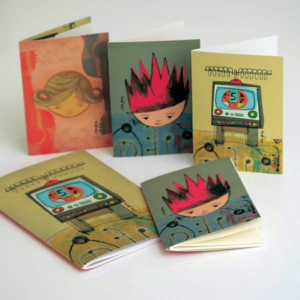
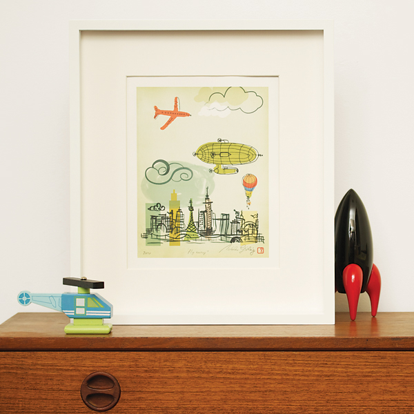
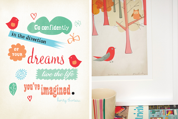
Husband and wife artists Mara and Nicholas Girling run Printspace – a boutique label specialising in combining art and product. Created for the young and young at heart, the Printspace collection is designed to be bold, memorable and timeless. Look for subtle textures in their prints and the attention to detail. Look for signs that the art was originated as a hand drawn image. Look for lovely variances in hand drawn line work. Look for iconic designs. See the yin and the yang of their combined creative work. Printspace is built around that wonderful reverberation. Spread the happiness, through colour, style and a little quirkiness.
How would you describe the combination of your styles?
The evolving Printspace colours are the result of years of research, personal instinct and collaboration between the two of us. They are warm and inviting, tasty but not saccharine. Think olive greens, warm pastels pierced by earthy and fresh yellows. A pointed red for affect and lovely subtle textures which you want to touch. We share an interest in Mid 20th Century art and design. Especially Danish design art and furniture, French advertising poster art, commercial art and modernist architecture. The art they produce compliments each other and creates a great balance of decoration versus iconic and graphic artworks. We have a quirky and tactile artistic style which is linked by colour and styles which we adore.
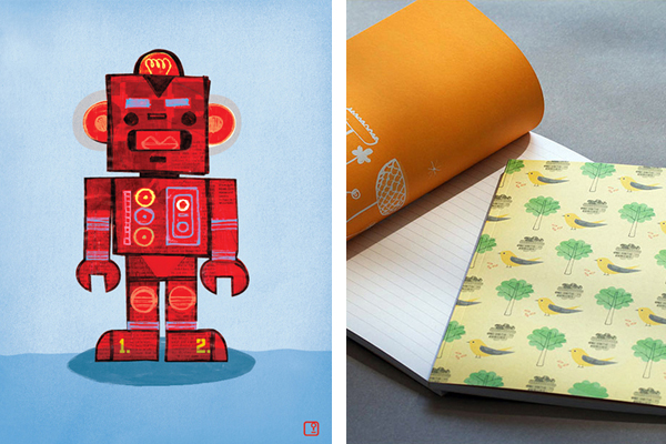
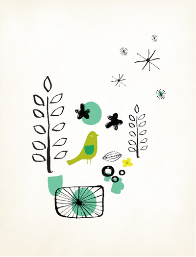
Mara: a purposeful yet naïve style. Think of beautiful patterns found on crockery from the late 1950’s. A hand drawn and painted image. A minimal elephant, a simple flower drawn with line work which varies between thick and thin. Dabs of colour link shapes. White space is as important as the figurative elements on the beautiful soft papers.
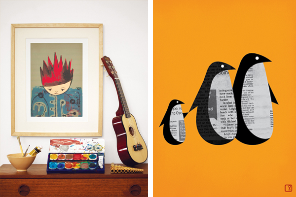
Nick: Inspired by the line where art meets design – a look to texture to soften iconic objects, to add dimension to sheer lines and solid shapes. The objects are familiar; like rockets, birds, and people but there is another more tactile level the artist want you to see. His artistic graphic prints are designed to be big and striking on walls. They are created with colours which stand the test of time. There are subtle references to cubism and Russian Constructivism with his own take on colour and shape.
What is your background and what lead you to start your own label?
We are both qualified graphic designers with several years of corporate and retail experience with a direct interest in branding and product design. It’s an interesting and inspiring place to be where art meets with products. We have an opportunity to make our stylistic mark within peoples homes and to grow with people as time goes on.
Where do you find inspiration for your pieces?
Mid century art, design and architecture, vintage posters.
How has your creative style developed over time?
Initially our artworks were more abstract and graphic. As we have evolved, the art has taken on a figurative aspect. Our colour choices are still based on the same sensibilities. We continue to inspire each other as artists and tend to follow our own instincts based on our knowledge of art history and our own instincts.
How do you work together as a collective and what is your creative process?
We plan the new ranges broadly, together, then create separately, and then critique & refine the work together, We make sure the art fits the Printspace brand as well as our own criteria. Mara is more methodical and Nicholas is more of the moment. When the artwork comes together, the overall collections have a combined yin / yang energy which is not often seen in other art labels works. No piece makes it into the collections without the other artists approval. We are very decisive and it can be exciting and frustrating. But it is a great way to ensure that the art is true to the label. This is core to how our art is different.
What has been the most rewarding & challenging aspect about Printspace so far?
MARA: To do something I love and to earn a living from it. Receiving direct feedback from our customers at markets, events and online is also rewarding and lots of fun. The most challenging aspect is juggling motherhood and me time with a business whilst trying to keep all the plates spinning a once.
NICK: Yes, talking with people at the events we participate in is great. There are some people who really get what each of us are doing. I think of children growing up seeing our art in their homes for years. I hope they feel a connection to the creations. The challenges are all part of the growth of the label. Like any label you need to continually define who you are based on beliefs. With art and personal expression we have always felt strongly about staying true to our artistic expression. It would be too easy to make half of the art blue and half of it pink. We are not interested in that.
What can we look forward to seeing from Printspace this year?
We can say that our label is expanding and we continue to invest in time to create new artworks and new products. You can be sure to find out first by following us on Facebook or via our newsletter.

